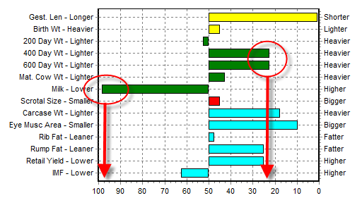
The EBV Percentile graph enables you to assess exactly how the current estimate of the animal's breeding value for each trait (and selection index where available) ranks compared with the two year old animals that have been evaluated within the same genetic evaluation.
A separate bar is provided in the graph for each individual trait, with the trait listed on the vertical axis. The direction of the trait is also provided for easy reference. The percentile bands are listed across the horizontal access.
As an example of how to interpret the EBV Percentile Graph, in the example below, the animal's EBVs are ranked in approx. the heaviest 25th percentile band for 400 Day Weight and 600 Day Weight, but the lowest 5th percentile band for Milk.